Measuring UX at Scale
Built a scalable feedback and measurement program that gave teams clearer visibility into user sentiment, experience quality, and where deeper research was needed.
Quantitative Strategic Research

My role: Senior UX Researcher and project co-lead. I led the strategy for what we measured, how we prompted users, how the data would be interpreted, and how the program would be used by teams across the business.
Company & product: D2L, Brightspace learning management system (LMS)
Scope: Long-term quantitative research and measurement system
Methods: UMUX, SUS & NPS scores, survey design, prompt targetting and throttling, prompt design, sampling logic, quantitative analysis, and dashboard/reporting design
The problem
Before this project, D2L had no consistent way to understand the user experience once Brightspace changes were live. We had strong exploratory and evaluative research before release, but no shared post-release measurement system that could show where the experience was improving, where friction was persistent, or which user groups were struggling most. That made it harder to benchmark UX over time, harder to prioritize follow-up research, and harder to show the impact of UX work across the product.
My goal was to help design an in-product measurement system that could generate trustworthy quantitative signals at scale: strong enough to benchmark experience over time, specific enough to diagnose where problems lived, and careful enough to protect the user experience, privacy, and client trust.
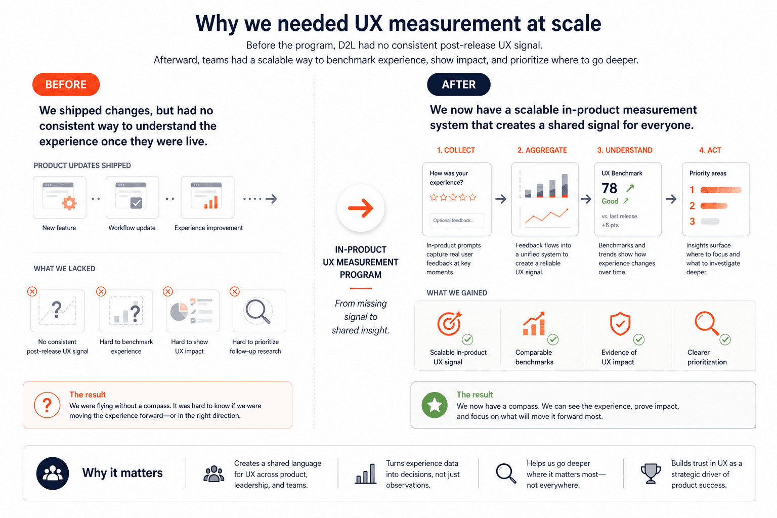
This project was not just about adding prompts into the product. It required designing a system that teams could trust, use repeatedly, and connect to real decisions over time. That meant working through a series of questions with partners across the company: what we should measure, which users we should start with, where prompts should appear, how often they could be shown, what guardrails needed to be in place, and how the resulting data would be interpreted and used.
Planning the system
This project was as much about alignment and systems design as it was about measurement. Before we could launch anything, I had to work through a set of strategic and operational decisions with partners across the company: what we should measure, which users we should start with, where prompts could appear, how often we could ask for feedback without harming the experience, what legal and privacy constraints had to be in place, and how the data would eventually be reported and used.
Answering those questions took real cross-functional coordination. I worked closely with my project co-lead and principal designers to shape the overall measurement approach and decide where prompting would be least disruptive in the product. I partnered with legal to set guardrails around anonymity, PII, and age-to-consent constraints. I worked with customer-facing and customer experience leaders to understand where clients might have concerns about over-surveying and what opt-out controls would be necessary to build trust. I collaborated with senior developers and vendor partners to figure out what was technically possible, how prompt rates could be controlled, and how to implement the logic in a way that was reliable and cost-conscious. And I worked with BI partners to make sure that once data started coming in, we would be able to analyze it in ways that were actually useful rather than overwhelming.
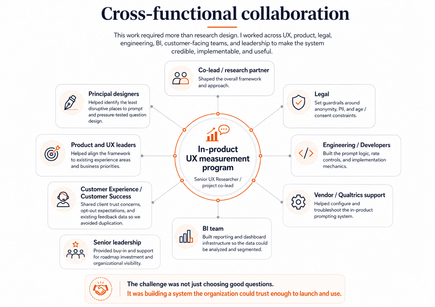
This planning phase mattered because the success of the program depended on more than choosing good questions. It depended on making the system credible — to users, to clients, to product teams, and to leadership — before it ever went live.
1. Deciding what to measure
One of the earliest and most important decisions was that this could not be a single-metric system. Different product questions needed different kinds of signal, so we designed the framework as three connected layers: UMUX Lite for a broad top-line benchmark, Experience Metrics for major areas of the product, and Workflow Metrics for more targeted pre/post-release measurement. I worked closely on this structure with my co-lead, principal designers, and product and UX leaders so that the framework would be credible from a research perspective, but also useful and intuitive to the teams who would actually use the results.
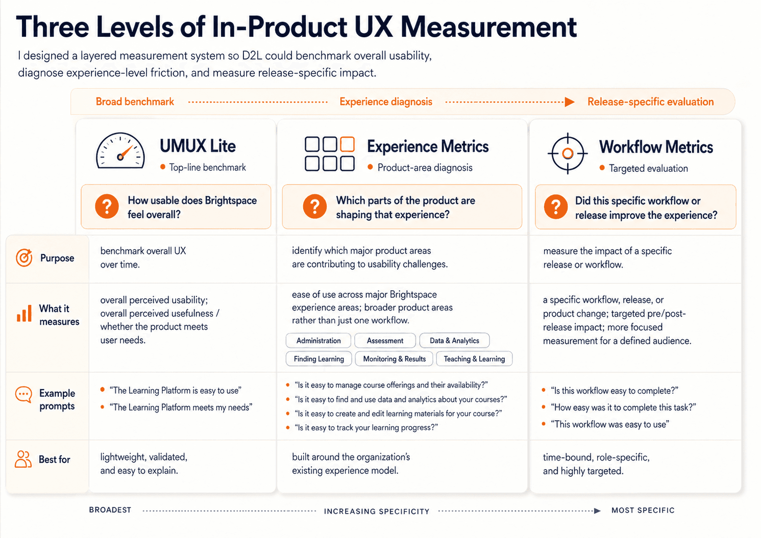
UMUX Lite
We chose UMUX Lite as the top layer because we needed a starting point that was lightweight enough to scale, but established enough to trust. It gave us a simple, industry-recognized measure of the two highest-level questions we cared about most: whether Brightspace felt easy to use, and whether it met users’ needs. That made it a strong foundation for long-term benchmarking. It also gave us a score that could be interpreted through broader usability benchmarks, translated into SUS-style thinking, and made easier to explain to non-research stakeholders and adjacent teams outside UX. Just as importantly, it was practical for in-product prompting: only two questions, low response burden, and realistic to deploy at scale. We were not choosing UMUX Lite because it could explain everything. We were choosing it because it gave us a credible top-line baseline we could track over time.
As I worked through the system design with my co-lead, principal designers, and product and UX leaders, it became clear that this top-line benchmark would not be enough on its own. It could tell us whether Brightspace felt usable overall, but it could not tell us where that perception was coming from. Product teams needed something more diagnostic — something that would help connect overall usability back to the actual parts of the product shaping that experience. That led us to define Experience Metrics.
Experience Metrics
At the time, D2L and the UX organization were already organizing Brightspace into major experience areas such as Administration, Assessment, Data & Analytics, Finding Learning, Monitoring & Results, and Teaching & Learning. Rather than inventing a new structure just for this project, we decided to build on that existing framing. That was an important strategic choice. It meant the measurement system would align with how teams already understood the product, how work was organized internally, and how findings would eventually need to be interpreted and acted on. Together, we pressure-tested what belonged in this second layer: which parts of each experience were most representative, most broadly relevant, and most worth tracking over time. We were trying to find the right level of specificity — specific enough to be meaningful and help diagnose problems, but broad enough to remain comparable over time. That collaborative process led to 10 instructor prompts and 5 learner prompts, each tied to a major experience area and written in a way that teams would recognize as representative of their space.
Workflow Metrics
As those discussions continued, another shared conclusion emerged: even experience-level prompts would not answer every kind of product question. They would help us understand how major parts of Brightspace were performing, but they were still too broad for teams trying to evaluate the impact of a specific workflow or release. So together we defined Workflow Metrics as the most targeted layer: time-bound prompts tied to a specific workflow or launch, shown only to relevant roles, and designed to support pre/post-release measurement. This gave teams a way to measure the impact of specific changes more directly, without overloading the broader benchmarking system or duplicating the experience-level questions.
What made the framework work is that each layer solved a different problem: UMUX Lite gave us a credible overall benchmark, Experience Metrics helped diagnose which product areas were shaping that benchmark, and Workflow Metrics gave teams a way to evaluate specific changes over time.
2. Deciding who, where, when, and how often to prompt
Once we knew what we wanted to measure, the harder question was how to collect that feedback without making the product experience worse. We also needed to be selective about who we started with.
Who to prompt
Brightspace serves many user types across higher education, K–12, and corporate learning, so we deliberately began with instructors and learners — the two largest and most experience-defining groups — so the system would be statistically useful, interpretable, and easier to scale responsibly. We later added administrator experience prompts as the system matured, but starting with instructors and learners gave us the strongest potential sample sizes and a more controlled rollout. Also, we decided that learners under 13 would not be prompted, which meant excluding K–12 learners entirely from the program.
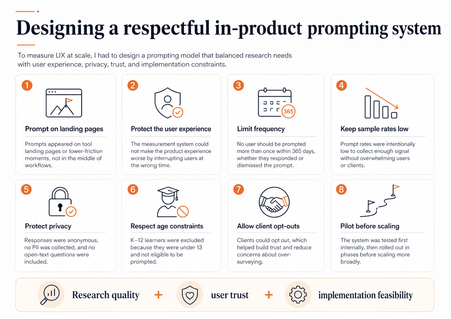
Where & when to prompt
I worked with principal designers and experience leads to identify the least disruptive places to prompt. We made a firm decision not to prompt users in the middle of workflows. Instead, prompts would appear on tool landing pages — lower-friction moments where we could ask for feedback without interrupting task completion.
How often to prompt
Prompt frequency required even more careful tradeoffs. Customer-facing teams were understandably nervous that clients might see this as over-surveying, especially in education where many users are already asked for feedback frequently. So we built the system around a few strong guardrails: users would not be prompted more than once per year, prompt rates would stay low, and users and clients could opt out.
These decisions were not theoretical. They were the result of working with legal, customer experience leadership, other researchers, the head of product and experience, and engineering partners to make sure the system was both trustworthy and implementable. We also needed cross-functional buy-in because this work required real roadmap and development investment. It was not something I could simply launch inside Qualtrics on my own.
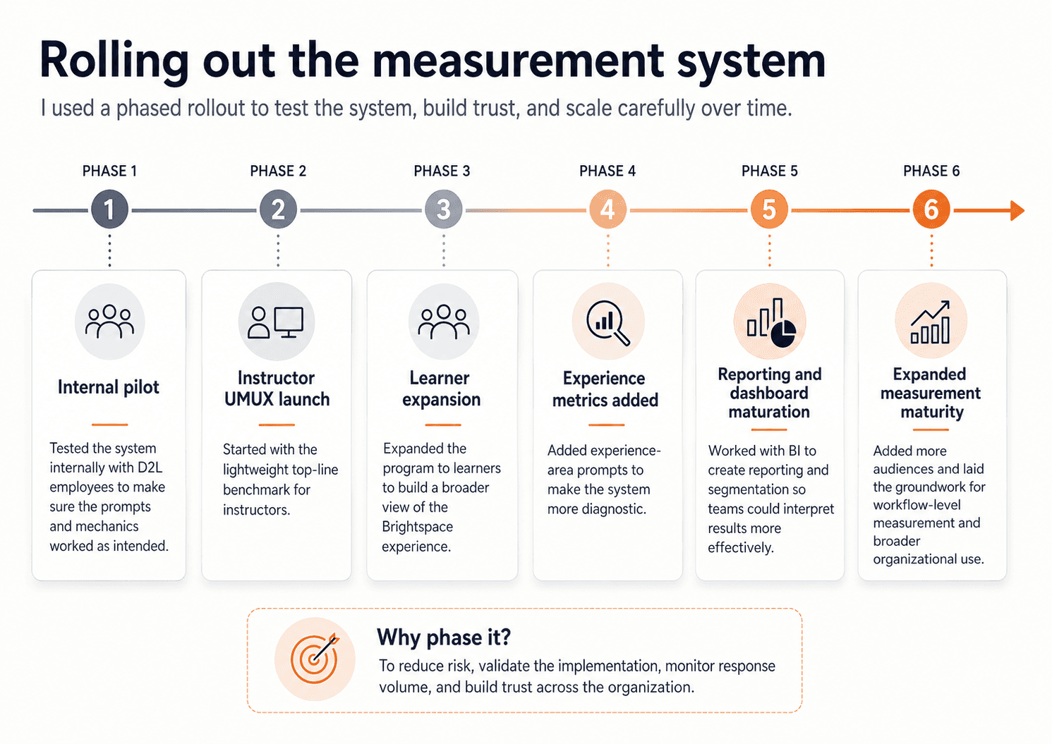
Releasing the prompts
We also piloted carefully. We started internally to make sure the prompts behaved the way we expected. Then we phased rollout in stages, beginning with UMUX Lite for instructors before expanding to learners and then to additional experience prompts. That phased approach helped us build trust across the organization and monitor the system as it scaled. It also gave us room to adjust the implementation over time, including working through vendor and accessibility issues before scaling more broadly. The point of phasing the rollout was not just caution — it was to reduce risk, validate the mechanics, and make sure the system was strong enough to sustain long-term use.
Designing the analysis and reporting model
Once the prompting system was in place, the next decision was how the data would actually be used. I did not want this to become a dashboard that looked impressive but created confusion. So I worked with the BI team to shape a reporting approach that could support recurring interpretation rather than one-off snapshots. That meant designing for role-based comparison, trend tracking over time, product-area comparison, and segmentation by region, language, and client profile where the data supported it.
We were not just looking at averages. We were looking at sample composition, distributions of ratings, Top-2-Box scores, benchmarks, quarter-over-quarter trends, and cuts by region and ACV where the data supported it. We also explicitly framed the limits of the data: this program could tell us what was happening and give us a sense of the scale of a problem, but not why it was happening on its own. That was an intentional analytical choice, not a weakness we discovered later.
I also worked with Customer Success to understand what feedback they were already collecting so we would not duplicate it carelessly. That led to useful comparison work between CSAT and UMUX Ease of Use, which helped show that high satisfaction did not automatically mean high usability. In our analysis, CSAT was much stronger than instructor ease-of-use, reinforcing the point that usability measurement was adding something distinct and strategically useful.
What we learned
Once the program scaled, it gave us something the company had not had before: a broad, recurring view of how Brightspace was actually being experienced in the wild. By FY26 Q2, the program had generated over 100k instructor prompt impressions, over 370k learner prompt impressions, and responses from 500+ client organizations. Completion rates were high — about 80% for instructors and 82% for learners — which helped validate the collection model.
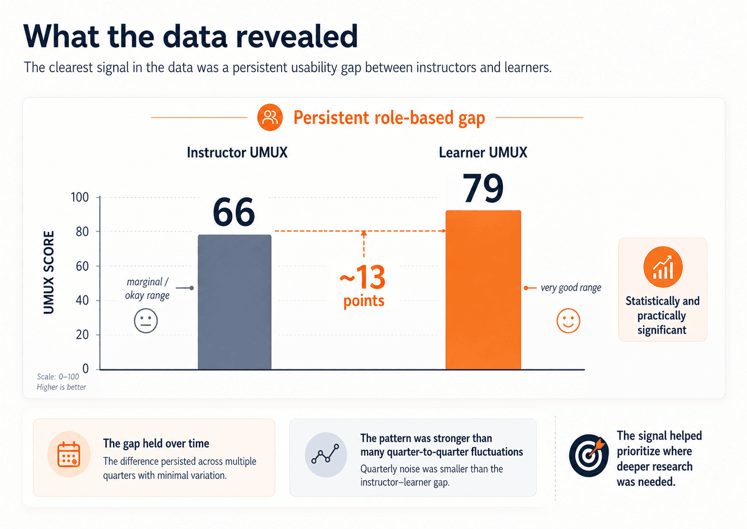
The clearest pattern in the data was the gap between instructors and learners. Using UMUX Lite, learners were scoring in the very good range, while instructors were landing in the marginal / okay range. In FY26 Q2, learner UMUX was 79 and instructor UMUX was 66 — a gap of roughly 13 points, described internally as both statistically and practically significant. That signal held over time. Quarter-to-quarter shifts were generally small; the more important pattern was the persistence of the instructor–learner gap itself.
The broad benchmark showed that a real role-based gap existed. The next step was understanding where that weaker instructor experience was coming from.
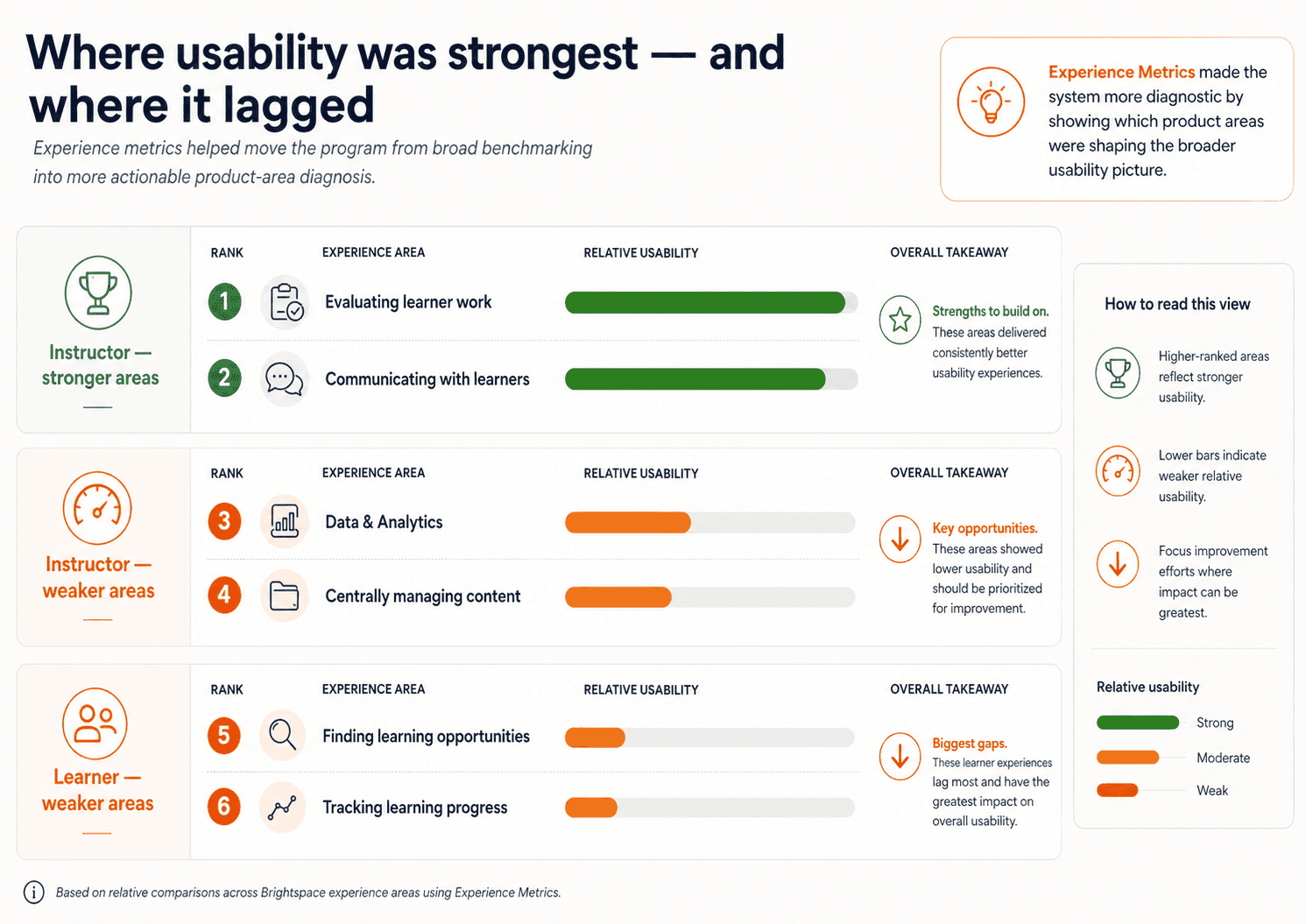
The deeper analysis helped us move beyond averages. We looked at distributions to understand how pain was concentrated, identified especially low-performing segments like K–12 instructors, looked at Top-2-Box to understand how many users were truly having highly positive experiences, and compared region and ACV to test alternative explanations for the gap. That led to a stronger synthesis: the core driver of lower usability was not contract size. It was role. And Experience Metrics helped make that broader signal more actionable by showing which product areas were contributing most to the weaker instructor experience and where learner usability still lagged.
Outcomes and impact
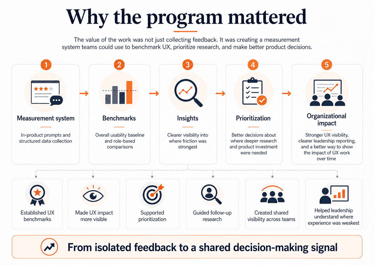
This project gave D2L something it had not had before: a consistent, company-visible way to measure and compare UX across Brightspace over time. It created benchmark scores, made role-based comparison possible, and gave teams a clearer view of where the experience was strongest and weakest. It also gave the UX team something important: a way to make the impact of UX work more visible. Instead of relying only on pre-release findings or isolated post-launch follow-up, we now had a measurement system that could show where usability was improving, where it was flat, and where follow-up research was needed most.
This work also had an organizational impact. I packaged and presented findings in ways that product teams and senior leadership could actually use. That meant not just reporting numbers, but reframing them. The key story was not “the numbers moved.” The key story was “the instructor experience is consistently weaker, and that gap is strategically important.” The value of the work was not “we have a dashboard.” The value was “we now have a trustworthy signal that helps guide research and product decisions.” That synthesis is what turned the program into a strategic input rather than just a reporting mechanism.
Reflection
The biggest lesson from this project was that measurement is only useful when it is designed to support decisions. The goal was never to collect more feedback for its own sake. It was to create a signal that teams could trust, interpret responsibly, and use alongside other evidence.
If I continued this work, my next step would be to make the path from high-level signal to follow-up action more explicit and repeatable. We already had recurring reporting and quarterly synthesis in place; the next opportunity would be to define clearer trigger points for when a pattern should move from “something to monitor” to “something to investigate,” build a more structured drill-down from broad benchmarks into experience areas and segments, and connect those signals more systematically to workflow-level measurement and targeted qualitative research. In practice, that would make it easier for teams to move from a result like the instructor–learner gap to a concrete next step: which area to investigate, which workflow to measure, and what kind of research or product response should follow.